Saturday, September 24, 2022

photo 1 - Cyanotype Butterfly


Cyanotype Butterfly by Aleah Ford

Wednesday, September 21, 2022

Monday, September 19, 2022

photo 1 - Fred Herzog - Kodachrome


Man With Bandage, 1968

archival pigment print


Research (book from library: Fred Herzog Photographs, published by C|O Berlin):

-Fred Herzog (1930-2019) was a German Canadian photographer who emigrated to Vancouver in 1953. He took coloured street photographs of Vancouver, using almost exclusively Kodachrome slide film (one of the early commercial colour films, know for it’s high resolution, life like colour, and broad tonal range).


-Herzog challenged the notion in the art world that colour photography was only for commercial and amateur use. His work shows that colour photography is not only as valid as black and white photography (something that isn’t much of an argument today, but was a big deal during the mid 20th century) but that colour can add elements to a scene that would otherwise be missing with black-and-white photography. Herzog is regarded as one of the early masters of colour photography.


-“Herzog’s photographs demonstrate that colour photography is not the addition of colour to a traditional black-and-white approach, but an autonomous means of expression.”


-Herzog took photographs of Vancouver in an attempt to discover the city and preserve his impressions of it. There is an overlying theme in his work of postwar urban culture, which branches off into various pictorial representations such as people on the street, old local businesses, and displays/advertising.


-Beginning in the 1960s Herzog would work as a medical photographer alongside his street photography.


(A few) notable Herzog photographs:

-Used Car Lot (1970)

-Mom (1959)

-Chung Wah (1960)

-His Last Bubble Gum (1960)

-AI Western Second Hand Store (1958)

-Paper Vendor (1959)

-Bargain Shop (1962)

-Lucy/Georgia (1968)

Sunday, September 18, 2022

photo 1 - Assignment 1 - I/You

Final Image:

Look

diptych photograph
iphone 10, photoedited. 

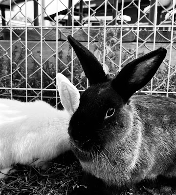
     For the project I wanted to compare animals with people. I visited a petting zoo to take images of various animals, but ended up choosing the bunny photograph for my diptych because of how one was perfectly positioned in front of the other, as well as a seeming connection to side view portraits (Victorian cameos, mug shots?). 
    For the contrasting photo I had my boyfriend pose for me, and then took a photo of myself from the same view/backdrop. I then photo-edited these images together using procreate (timelapse below). I edited the photos on my phone by changing them to black and white (further connects them - less colour to distract and seperate the images) and increased the contrast. I put his photo in front of mine because of his darker hair and my lighter hair to better imitate the fur of the rabbits. 
    I think that by displaying people next to animals it pulls out the humanity of the rabbits further for the viewer and establishes empathy for the animals. I attempted to create a connection here between the ‘I’ (humanity) and ‘you’ (all other creatures), in a way that would - when displayed side-by-side -  call human beings back to our roots as still being part of the animal world and question our assumed superiority over nature.

Progress: 
Timelapse
Easy editing, done on procreate

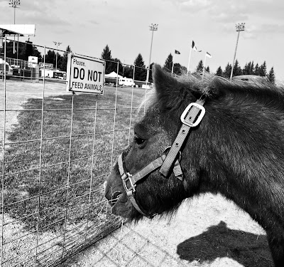
Other Animal photos:
A similar pose to the rabbit photograph I went with


I liked this photograph with the sign saying “Do not feed animals” and the pony eating.


First Attempt/Alternative Response:

    I wasn’t happy with my first attempt at the project, so I redid it. I still felt I should post it however. 

Reflect

diptych, iphone 10. 

    For these photographs I took two pictures of my window; one with the light on (so that I show up) and the other off (so only the outside world is visible ). I wanted the “I” to be the viewer (myself here), and the “you” to be the viewed (what is outside the window). What I find interesting about this set of images is that both are essentially photographs of the same thing - a pane of glass.

    No photo-editing was done to these photographs, and I am not quite sure how my phone picked up these colours, but that is one other thing I like about these photos.

    What I don’t like is the iphone camera present in the bottom image, and the overall “rushed” feeling I tend to get from this set of images, which is why I decided not to use them for my final diptych.